


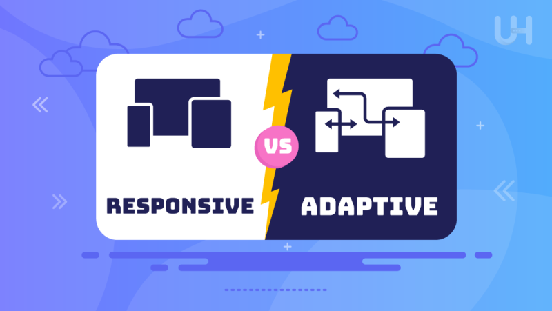
When thinking of building a website to provide an excellent user experience across devices, two names pop up: responsive vs adaptive design. Both approaches in design make your site look great and function wonderfully, be it on a desktop, tablet, or smartphone. Still, they reach this goal by different means. A question would be, which will serve your website best?
In this article, we will examine the differences between responsive vs adaptive design, considering their strengths and weaknesses and cases of application. By understanding how each design method works, you will make a weighted decision on which approach best aligns with your website goals and audience needs.
What is Responsive Web Design?
Responsive web design provides a flexible way of developing websites that essentially automatically change their layout, pictures, and content according to screen size. Instead of making a different version of websites for each different type of device, which is time-consuming and requires more effort, response design with CSS media queries changes depending on the viewport in use. It flows smoothly and provides a smooth user experience on all platforms, from smartphones to desktop monitors.
The philosophy governing responsive web design is basically “one size fits all.” That means the design and content flow dynamically, resizing elements like images and text blocks and reorganizing layout structures to fit various screen dimensions. Since responsive websites are based on flexible grids, they can upscale or downscale without requiring the creation of different targeted versions for different devices.

Pros and Cons of Responsive Design
Pros
- A single codebase for all devices, reducing complexity.
- Flexible and fluid design that adapts to all screen sizes.
- Easier to maintain, as changes are made in one place.
- Better for SEO, as it uses one URL for all devices.
Cons
- It can be slower to load due to downloading content for all devices.
- Requires more testing across various screen sizes to ensure proper functionality.
- Some design elements may not work as well on certain devices.
Examples of Responsive Design
Dribbble
Dribbble is a community of creative professionals who showcase their work. It uses responsive web design so that its content is optimally displayed on any device. The fluidity of responsiveness allows Dribbble to maintain the same user experience, whether browsing on big-display desktop monitors or small-screen smartphones. This flexibility helps designers and artists share their portfolios with a global audience, no matter how they access the site.

Shopify
The leading eCommerce platform has taken the responsive design approach to make Shopify comparably easy to manage for both an online store owner and a shopper on various devices. Shopify, adaptive to various screen sizes in layout and functionality, lets businesses manage their storefronts comfortably, and customers shop easily on the move without any need for separate mobile and desktop versions. All this consistency across devices creates a seamless shopping experience, which is critical for ensuring good conversion rates and satisfying users.
What is Adaptive Web Design?
Adaptive web design does things a little differently. Instead of designing a single fluid design that changes itself based on screen size, for example, adaptive design serves the browser a range of different layouts destined for a range of screen sizes. Essentially, as a user comes onto a website, the dedicated server host decides which device they are on and serves them a specially written layout that would work best with that device. It might be specific desktop, tablet, and mobile screen designs in this case.
Although adaptive design means designing several versions of the website, this can lead to optimal experience on each device. However, it also requires much more work upfront since the designer and developer must create specific layouts at every breakpoint.

Pros and Cons of Adaptive Design
Pros
- Optimized user experience for each device, ensuring fast load times.
- Allows for specific, targeted design elements tailored to different devices.
- Reduces the amount of unnecessary content on smaller devices, enhancing performance.
Cons
- Requires separate designs for multiple screen sizes, increasing development time.
- More difficult to maintain due to multiple versions of the same site.
- It may not work well on screens that fall outside of predefined breakpoints.
Examples of Adaptive Design
IHG
InterContinental Hotels Group follows the adaptive Web design, which will render different layouts depending on the device currently accessing the website so that each of its visitors will see the content differently. Whether booking a stay on a desktop, tablet, or smartphone, IHG can show up with a differently designed interface suited to that device’s capabilities. Such an adaptive design results in extreme optimization for each user, offering huge improvements for processes of mobile booking-one of the most important parts of the travel industry.

USA Today
USA Today uses adaptive design to present news stories to the widest possible audience. The layout changes according to screen size, whether opened on a big screen or through a small smartphone, and will show articles, videos, and commercials that are accessible through them. Media queries inside this design sometimes resize images, text, and navigation menus.
Supercharge Your Website with Fast WP Hosting!
Are you ready to optimize your website’s performance, regardless of your chosen design approach? With responsive or adaptive design, having Fast WordPress Hosting from UltaHost is crucial for delivering the best user experience.
Responsive vs Adaptive Design: Comparing the Differences
Both, responsive vs adaptive design, have pros and cons. While responsive design focuses on one fluid layout, adaptive design focuses on tailored layouts based on many devices. But how do they compare, side by side?
| Feature | Responsive Design | Adaptive Design |
| Layout | Fluid, adjusting to all screen sizes | Fixed, with multiple predefined layouts for specific devices |
| Development Complexity | Easier to develop, as it uses a single layout | More complex, requiring multiple versions for different devices |
| Performance | Can be slower on mobile due to loading all elements | Faster on mobile as only device-specific elements are loaded |
| Maintenance | Easier to maintain with a single codebase | More difficult, as multiple layouts need to be updated |
| User Experience | Consistent across all devices, but less device-specific | Optimized for each device, providing a tailored experience |
| SEO Impact | Better for SEO with one URL for all devices | Potential issues if separate URLs are used |

Adaptive vs Responsive Design: Common Mistakes

While responsive and adaptive designs take slightly different approaches to improving user experience, similar mistakes a designer can make effectively undermine the effectiveness of each. Avoiding these common design mistakes is crucial for success, whether you’re leaning toward responsive or adaptive design.
Too Much Focus on Desktop Versions
One of the most common pitfalls of such a design is giving maximum importance to the desktop version of the website and forgetting about mobile device users. As most users now browse through their mobile devices, having a mobile-first indexing approach during the designing phase is essential to offering the best user experiences on every platform.
Not Considering Gestures
Users who navigate your site on mobile rely so much on gestures-tap, swipe, and pinch-end designing. This may frustrate users and affect the overall user experience. Be sure to account for how users will interact with your site on touchscreens.
In particular, small buttons or other clickable targets that are difficult to click contribute to poor user experiences, particularly on mobile devices. Make sure that interactive elements, such as buttons and links, are appropriately sized and spaced to admit touch inputs and minimize potential sources of user frustration.

Putting Design Over Functionality
When too much emphasis is placed on aesthetic design without consideration for functionality, things can boomerang. While your website may look good on the surface, visitors won’t be there very long if it’s confusing to navigate and use. Balance design with equal usability to arrive at a website that looks good but also functions well.
Having a Separate URL for Mobile
In this regard, having a separate URL for a mobile site, such as “m.example.com,” can generate problems regarding SEO, maintenance, and user experience. Opting for a solution like an SEO virtual private server with one single URL across all devices is better to avoid such potential issues and improve site management.
Not Accounting for Future Maintenance and Development Costs
This will most definitely cause headaches afterward since future website maintenance and development costs might not be accounted for. Adaptive designs, especially, need constant updates to keep layouts working properly across new devices, which is usually very time-consuming and costly.
Conclusion
Whether you choose responsive or adaptive design will depend on your website’s goals, target audience, and development resources. Responsive design offers flexible capability and ease of maintenance, whereas adaptive design will provide a more custom-fitted experience for particular devices. You just have to weigh the pros and cons of both responsive vs adaptive design approaches to decide which strategy works for your website’s long-term success.
Secure hosting is key to protecting your site, whether you choose a responsive or adaptive design. UltaHost’s Secure Hosting WordPress provides robust security and reliability to keep your website safe and optimized across all devices.
FAQ
What is the difference between responsive vs adaptive design?
Responsive design adjusts fluidly to all screen sizes, while adaptive design delivers specific layouts for different device types.
Which design approach is better for SEO?
Responsive design is generally better for SEO because it uses a single URL for all devices, simplifying search engine indexing.
Does responsive design work on all devices?
Yes, responsive design works on all devices by automatically adjusting its layout and elements based on the screen size.
Why is adaptive design more complex to develop?
Adaptive design requires multiple versions of a website, each tailored to different device breakpoints, making it more labor-intensive.
Can I switch from adaptive to responsive design later?
Yes, it’s possible to switch, but it requires redesigning the website to be fluid and scalable for different screen sizes.
Which is faster: responsive or adaptive design?
Adaptive design is generally faster on mobile devices because it only loads elements tailored to the specific device.
What are common mistakes to avoid in each design?
Common mistakes include focusing too much on desktop versions, not considering mobile gestures, and using separate URLs for mobile sites.


