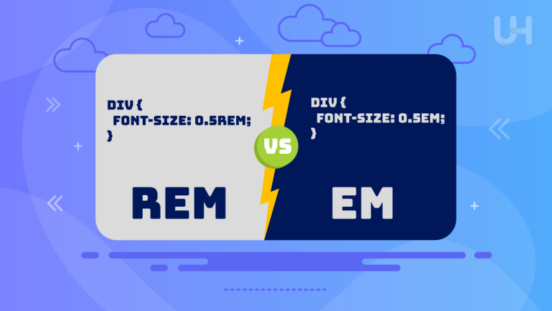
Speaking about text and layout scalability, in general, within web development and design, it’s an important aspect that directly relates to responsive and accessible web design. That’s where relative CSS units come in-two of them being REM vs EM. Both are relative units that could bring flexibility that might not be achievable by using fixed units such as pixels. However, despite their similar usages, the ways they act and thus affect the design of a webpage differ importantly.
In this article, we will discuss REM vs EM in great detail, breaking down what makes each one unique, reviewing their advantages and disadvantages, and giving practical examples to show when each is most effective. By learning REM and EM, the web developer has a better choice for scalable and responsive design that works seamlessly on devices.
What is REM?
REM stands for Root EM, a CSS unit that refers to the HTML font size of a root element, which is, in most cases, the <html> tag. REM units allow the designer to specify the sizes with respect to this root font size, allowing all elements sized using REM to scale consistently from that one central reference point. For example, if the root font size is 16px, then 1rem will be equal to 16px, 2rem at 32px, and so on. This gives designers a single global font size specification in the root element and thus yields a consistent scaling effect throughout the site with minimum hustle in responsive or adaptive design.
The advantage of using REM is that it provides predictable and regular results, which is helpful in responsive web design. You can define the root font size in one place and have all other elements using REM units scale accordingly to adapt to different window sizes, improving accessibility if users need larger or smaller text.
Advantages of REM
- Consistency: Provides consistent scaling across your website, especially when paired with powerful servers that can handle rapid scaling and complex CSS.
- Simplified Responsiveness: Easier to create responsive designs, as adjusting the root font size scales the entire layout.
- Accessibility: Beneficial for users needing different text sizes, as REM adjusts easily with browser settings.
- Predictability: Since it references the root element, sizes remain consistent regardless of where they’re used in the DOM structure.
Disadvantages of REM
- Limited Flexibility: Can lack adaptability for components that require a more local or parent-relative scale.
- Over-reliance on Root Settings: All elements are influenced by the root font size, which may not be suitable for complex designs requiring distinct scaling in nested elements.
- Global Impact: Changing the root font size affects the entire layout, which may not always be desired.
What is EM?
Another relative unit in CSS that works differently is the REM unit. Instead of EMs reaching the root font size, they base their unit sizes on either an element or a parent element’s font size. Therefore, the commonly-applied EM unit tends to be more dynamic and capable of capturing different contexts. For example, if its font size is set to 16px for any element, then 1em would be equal to 16px for that element if the parent changes the font size. Accordingly, the sizes based on EM change to cause a cascading effect.
EM can prove useful for designs where components, such as buttons or menus, need to scale atop one another. However, compounding or unexpected responses with EM can occur, mainly with deeply nested structures.
Advantages of EM
- Flexible for Component Scaling: Ideal for elements that need to scale relative to their parent container.
- Nested Adjustability: Enables easy adjustments in nested elements, making it suitable for modular component designs.
- Contextual Adaptation: Can easily adapt to different contexts, which is helpful for complex component hierarchies.
Disadvantages of EM
- Unpredictable Scaling: Nested elements with EM can lead to compounding sizes, resulting in unexpectedly large or small elements.
- Complexity in Deep Structures: EM can lead to unintended scaling effects in complex designs with multiple nested elements.
- Inconsistent Readability: EM units may not produce consistent sizing across the site because they rely on the parent font size.
Other Units of Measurement
While PX, EM, and REM units are mainly used for font sizing, the units %, VW, and VH are often used to set margins, padding, spacing, and widths or heights.
Put differently, VH stands for “viewport height,” which is the height of the visible screen; hence, 100VH covers the full height of the viewport. Similarly, VW stands for “viewport width,” or all the width of the screen, whereas 100VW covers the full width of the viewport. The % unit depends on the parent element’s size, not the viewport.
Enhance Your Site’s Responsiveness With Fast Hosting!
Want your CSS designs to load smoothly and adapt quickly on any device? With Fast WordPress Hosting from UltaHost, you can optimize your site’s performance, making REM and EM units work even better for scalable, responsive design.
Importance of REM and EM Units
Understanding the differences between REM and EM units is critical in constructing responsive, accessible, and extendable web design principles. REM, on its part, is based on the root font size and gives consistent sizing across elements, ideal for layouts and typography trends that must look consistent across devices. On the other hand, EM depends on a parent object’s font measurement and is more flexible in nested components, though less predictable when overused. This would allow for the creation of adaptable components to ensure readability and a seamless UX across screen sizes and contexts by knowing when to use each unit.
REM vs EM: Key Differences
Both REM and EM serve as valuable tools in CSS, but they offer different scaling mechanisms that suit various design needs. Understanding their distinctions can help developers choose the right unit for specific design goals. Below is a comparison of REM vs EM:
| Aspect | REM | EM |
| Reference Point | Root font size (typically <html>) | Parent or current element font size |
| Consistency | Consistent across all elements using REM | May vary due to nesting and hierarchy |
| Responsiveness | Easy to control by adjusting root font size | Context-based and flexible per element |
| Common Use Cases | Layout, typography, site-wide styles | Component-based scaling, nested items |
| Potential Pitfalls | Limited flexibility in local contexts | Compounding effects with deep nesting |
EM vs REM: When to Use Each?

For high-performance, large-scale sites, enterprise WordPress hosting provides the speed and reliability needed to support complex, dynamic content. This robust hosting enhances REM and EM units’ effectiveness by ensuring fast load times and consistent performance, making your site more responsive. Choosing between REM vs EM depends on your design goals, as outlined below.
REM
- Use REM for defining layout structures and typography that require consistent sizing.
- Ideal for setting global font sizes and ensuring responsiveness across the entire site.
- Effective in projects prioritizing accessibility, as adjusting the root font size can scale all REM-based elements easily.
- Works well for general responsive design, as a single change in the root affects all elements, reducing the need for multiple adjustments.
EM
- Use EM when creating components that need to scale relative to their parent containers.
- Beneficial for modular elements, such as buttons or cards, where context-based scaling is preferred.
- Ideal for complex designs requiring distinct sizing in nested elements.
- Useful in component libraries where components should adapt flexibly to different containers and screen sizes.
Conclusion
Using REM or EM units in CSS significantly impacts the scalability and responsiveness of a website. Knowing in detail the key differences between how REM is based on the root font size and how EM changes its value based on its parent element allows designers to make an educated choice based on their project needs. Using either REM or EM with some advantages and limitations can make the consistency and flexibility of your design more worthwhile for a better user experience.
Mastering REM and EM units is just the beginning of a responsive, optimized WordPress site. With reliable WP hosting from UltaHost, you’ll ensure your CSS designs load quickly and perform flawlessly.
FAQ
What’s the main difference between REM and EM?
REM is based on the root font size, while EM is based on the font size of its parent element.
Why is understanding REM and EM important?
It helps create responsive, accessible designs that scale well on different screens.
When should REM be used over EM?
Use REM for consistent, site-wide elements and EM for local, component-based scaling.
What are the challenges with EM?
EM units can lead to unexpected scaling, especially in nested elements, as sizes can compound and grow based on parent elements.
Can REM and EM be used together?
Yes, you can combine them to control global and local scaling.
How does root font size affect REM?
Changing the root font size scales all REM elements, aiding accessibility.
Are REM and EM better than pixels?
REM and EM offer more flexibility and responsiveness than fixed pixels, especially for designs that adapt to various screen sizes and user preferences.


