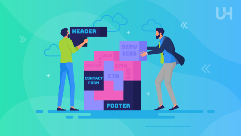
A landing page is always created with a specific action in mind, e.g., to sell a product or service. Simplicity and structure make it a killer sales tool, but it’s also an advantage for you because it makes it easier to create. Therefore, it is worth designing it using a specific scheme.
What do you need to know when creating a landing page?
The crucial element of a landing page is a coherent, clearly defined goal that emphasizes its other components. The proper target will assure you that the recipients will pay attention to the appropriate elements. As a result, they will perform the action you expect from them.
A valuable tip is to create the landing page in a separate subdomain. Then you may perfectly match key phrases to the landing page and set up the SEO strategy. However, it is not required, especially when the landing page is only an element of the marketing strategy.
If you direct the customers via other marketing channels, such as social media marketing or influencer marketing, it is enough if you place the landing page on a separate subpage.
Here are the elements you need to include.
Encouraging headings
The headline makes users decide to visit your website or landing page. Therefore, try to make it catchy but also indicate what recipients can find inside. The solution is to emphasize the benefits of achieving a specific goal and underline the features of a given product or service.
Allow yourself a bit of creativity but remember that the headings must immediately indicate the content. After all, Internet users are usually guided by them even before they start reading the rest of the text.
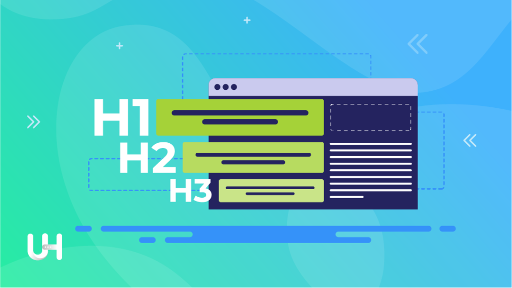
Also, don’t forget about SEO rules! Google doesn’t provide specific numbers about the proper length for a page title, but it does matter. Experts agree: a site title should be no less than 10 and no more than 70 characters. Lower-level headings (h2 and h3) should be shorter, preferably on one line.

If you want to position the landing page in search engines, you will face a tough challenge because you will have to consider SEO, marketing, and UX guidelines when creating headings.
Google gives a greater rank to headings, thanks to which the algorithms position them better; they catch the eye of visitors, increasing marketing effectiveness; they help to navigate the website, improving the website usability.
Distinctive graphics
A landing page cannot exist without distinctive graphics. After all, they attract attention, encourage extended browsing, and at the same time provide information. Therefore, make sure that the main photo is expressive. Also, make it color-related to your company, match the theme, and even present a specific product or service.
Subsequent parts of the landing page should also contain eye-catching pictures, infographics, and icons. If you additionally enrich the page with animations, you will interest the recipients without fail. Just remember to keep moderation because too many complex elements will distract users, reduce the usability of the landing page, negatively affect performance, and lower its SEO ranking.
Infographics are great for a landing page. This tool must keep the user’s attention at a high level, so if you want to provide some data, you should do it in the form of an infographic. Charts nicely integrated into the graphics, accompanied by a conclusion that the user should draw, will speak to them much better than dry text containing the same data.
Visible Call to Action
The recipient entering your website must know what you expect from them. A visible and encouraging Call to Action will help with it. Therefore, ascertain to place them at the top of the page and under some blocks.
You never know which landing page element will appeal to a given customer, so you need to try to increase the effectiveness and universality of your landing page by placing CTAs in places where the customer is most likely to click.
The number of CTA buttons on the page depends primarily on the length of the landing page; usually, you should insert 3 or 4 CTAs. One at the beginning, one at the end, and one in the middle (or two for longer landing pages).
Are you wondering which Call to Action works best? First, those that are clear in terms of appearance and message. Therefore, use simple slogans like buy now, sign up, read more, or order now. It is also a good idea to refer to the client’s goals in the CTA: I want to lose weight, I want to develop my business, and I want to sell my product.
Pay attention to aesthetic considerations; choose a button in a contrasting color. Then Internet users will almost certainly notice the button.
A block with benefits
Recipients always want to be sure that the product you advertise will bring them authentic benefits. Underline them, and you will make users aware of the sincere value of your offer.
Remember that customers don’t buy pillows; they buy comfort while sleeping. They are not interested in a programming course but in a successful career. They don’t want a snowboard – they want excitement. So, if you are wondering what a landing page should consist of, be sure to place a block with benefits on the page.

It is one of the most crucial elements, so double-check to place it at the top of the subpage. Also, use animations or graphic elements to emphasize the importance of every single advantage. Customers buy with emotions, and multimedia evokes the greatest ones.
Remember to indicate the benefits that are important for your target group. Conduct a thorough analysis, and then you will discover what is essential and determines the choice of a given product or service.
Contact form
Each landing page ought to contain an accessible contact form, no question. You can place two blocks – one at the top of the page and the other at the end. You will increase the chances that the user will contact you.
However, do not overshadow the CTA – you want the user to take a specific action. The contact form is an emergency solution for customers who are not entirely convinced and have additional questions.
Make sure that the form is effective and, at the same time, does not overwhelm the visitors. It’s best if you limit yourself to a maximum of 3-4 fields. Then you will get the most crucial information that will allow you to continue contact. In addition, make sure that this block looks interesting. After all, it is one of the essential elements of the website, so it should stand out a bit but not overwhelm.
Price list
Many users appreciate the landing page with the price list. Often, this element determines whether they delve into the content at all. If your sales strategy allows it, place it on your landing page. Very often, the lack of information about prices acts as a deterrent; the customer wonders why you hide them.
They could think that prices are so high and you’re afraid to show them. So there’s no point in wasting time browsing your site further. Therefore, it is worth adding a block with prices, although it is not mandatory.
A special case is when the costs are determined individually. Then you can add such information and place a CTA button next to it. However, even in this situation adding sample quotes can give the client an idea of your prices. A valuable solution is to conduct a free valuation.
Try to add any information on costs because for many clients it is a key factor when making a purchasing decision. In addition, adding prices increase the substantive value of the landing page even more. Another thing is that sooner or later, the customer will have to know the price, so you can’t run away from it. After all, they won’t pay you an unknown sum.
Conclusion
Landing pages are a vital part of your success, and when done right, they can get your visitors to take the action you want them to take.
An effective landing page must meet various requirements and contain the listed elements. When you make a well-functioning landing page, you will be able to enjoy a high conversion rate, so it’s worth the effort.
If you enjoyed this article, then you’ll love UltaHost hosting platform. Get 24/7 support from our support team. Our powered infrastructure focuses on auto-scaling, performance, and security. Let us show you the difference! Check out our plans!


