We see them every day. From print ads to magazines, there are all kinds of fonts in the world.
Whether you are an e-commerce store owner or a budding blogger, one thing all websites have in common is the use of text for content.
Putting some thought into your display text (or typographic design) is unsurprisingly important when creating an overall aesthetic for your site and for ensuring its success.
But most importantly, they should be web-safe fonts.
What are secure web fonts?
Web-secure fonts are font styles that are usually pre-installed and can be viewed on most devices – computers, mobile phones, smart TVs, and tablets.
Should I use secure web fonts for my website?
Short answer: Absolutely.
If you want to maintain consistency in the design and visual branding of your website, using a web safety font ensures that your site looks exactly the way you wanted it to.
Here are the best 20 HTML web fonts for you in 2022
Arial (sans-serif)
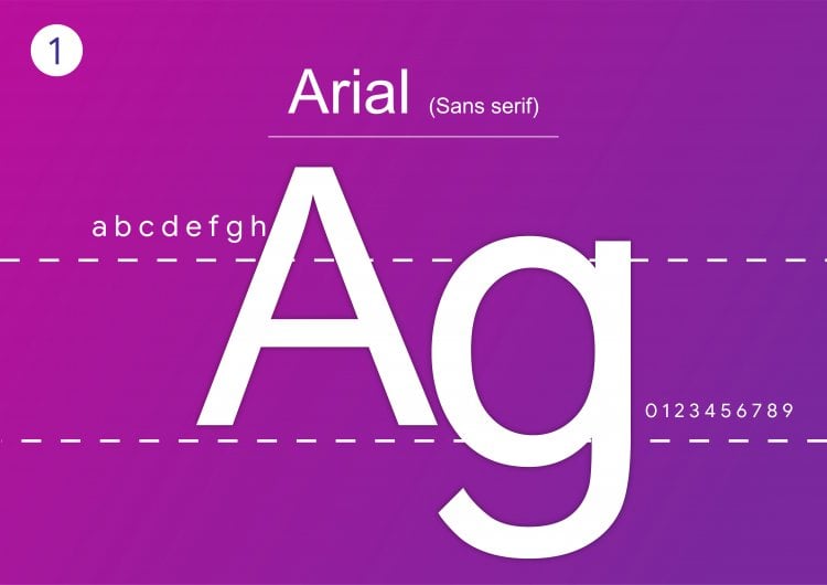
Arial is the most widely used sans-serif font on the web. It was created for printers who wanted to use the popular Helvetica font without the licensing fees. Therefore, they’re virtually identical.
Arial and members of the Arial font family are considered the safest web fonts because they’re available on all major operating systems.
Times New Roman
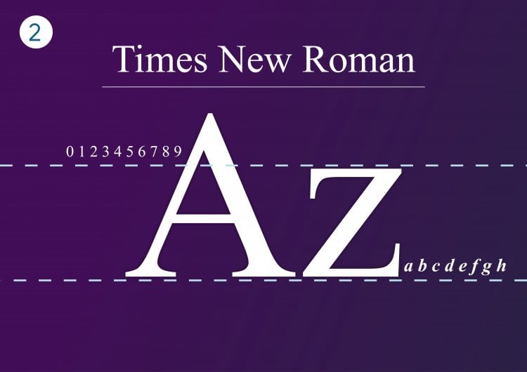
Personal favorite of mine, one of the most popular ones worldwide. Offers professionalism and general structure to your website.
Courier New
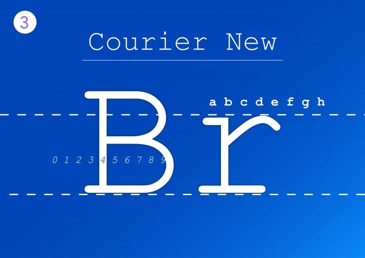
Courier new is an older style newspaper-Esque HTML font. It is the right choice for you if you are looking for a simple monospace font.
Arial Black (sans-serif)
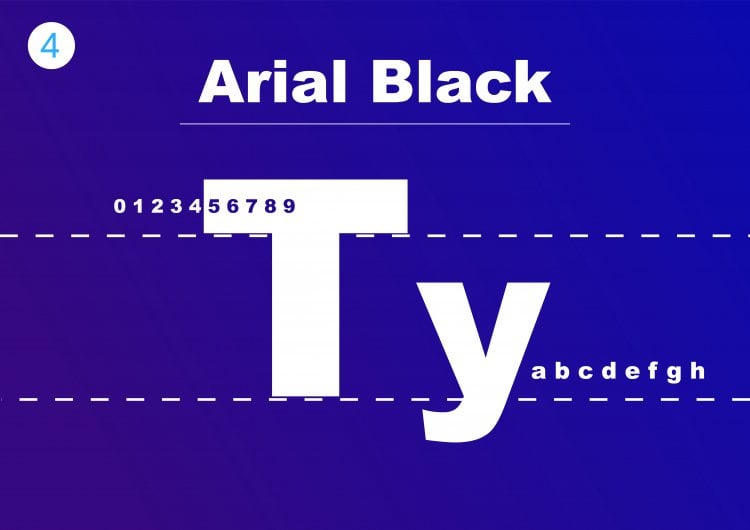
Arial Black is another related font in the Arial family. It’s a very bold version more suitable for headers, decorative text, and emphasized text. However, its prominence means designers should use it strategically and carefully.
Arial Narrow
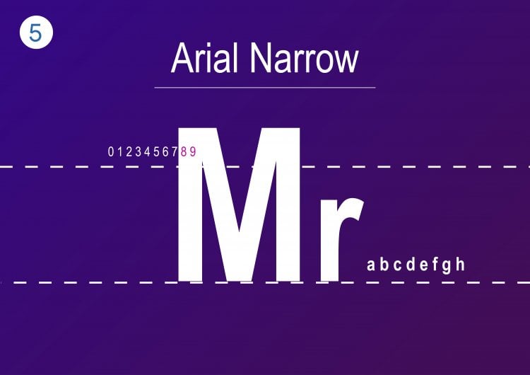
Arial Narrow is one out of 38 styles of the Arial font family. Compared to the original typeface, this style offers a much sleeker design.
Letters appear narrow and condensed, with little space between them. This makes Arial Narrow a great choice for minimalistic websites.
Great font-pairing options include bolder sans-serif typefaces such as Verdana and Geneva.
Candara
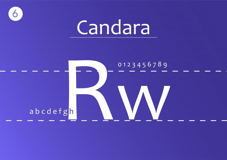
Candara was first brought to the mainstream by the Microsoft Vista OS to improve readability on LCD displays.
This typeface is highly readable due to the generous spacing between characters, making it a perfect display font.
Moreover, Candara achieves a contemporary look thanks to its curves and open forms. This font is suitable for informal typographic settings such as blog post titles and taglines on websites.
Verdana (sans-serif)
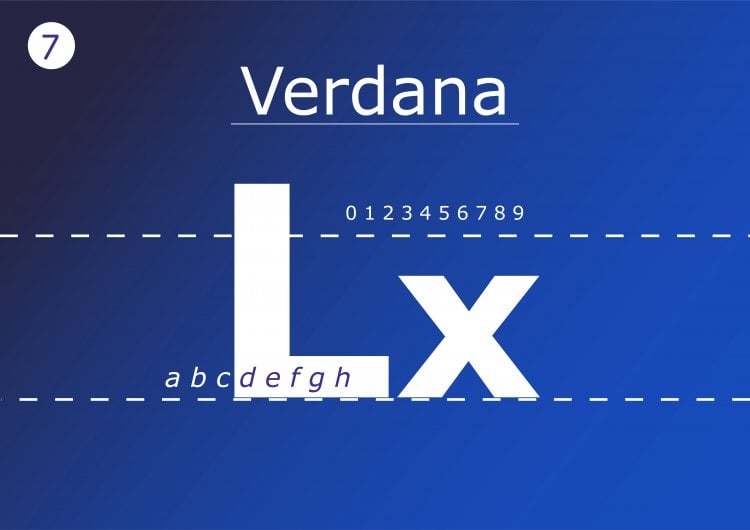
Verdana is popular both online and off. While it resembles Arial and Helvetica, it has a simple structure that makes the letters large and clear. Some of its characters have elongated lines, which may be incompatible with some designs. Otherwise, it’s a solid alternative to Arial.
Garamond
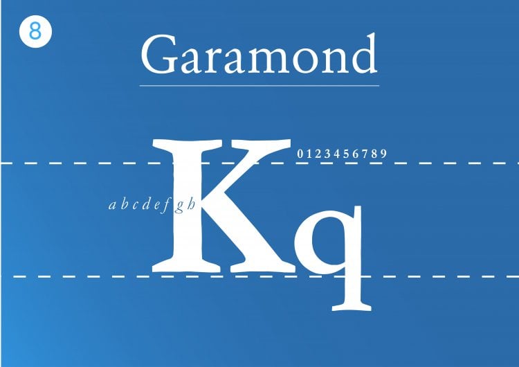
This is an old-school type of font which is used first in the 16th-century Paris.
Times
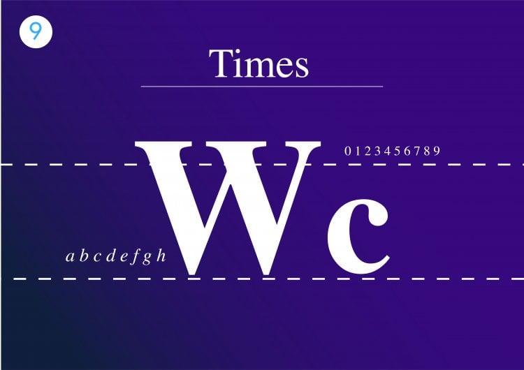
Times is a highly legible serif font due to its visible contrast and condensed style.
People tend to be familiar with this font as it’s found in a variety of media, from books and messaging apps to commercial publishing projects.
Originally, Times was primarily used in printed media such as newspapers, becoming associated with journalism and academic writing ever since.
Therefore, this font is the perfect choice to create a familiar and formal feeling on your website.
Additionally, this font is suitable for websites with long blocks of text, such as online newsrooms and blogs.
Georgia
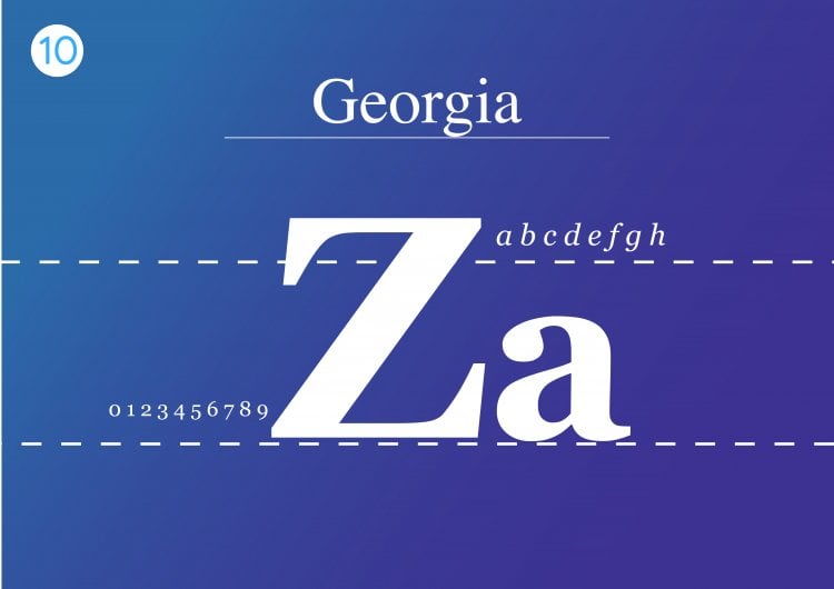
Georgia is a true web font with simple San serif line and its large upper size. The letter is almost elongated, which make it easy to read online font.
Trebuchet MS (sans-serif)
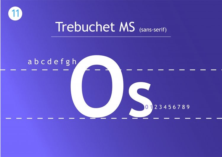
Trebuchet MS is another web-safe san-serif font, designed by the Microsoft Corporation in 1996. It’s commonly used for the body copy of many websites and can be a solid alternative to your site’s sans-serif font. It also may not look as “basic” as Arial.
Bookman Old Style
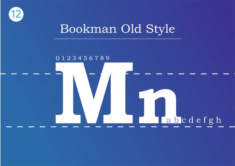
This font has a great structure, it’s bold and appealing.
Helvetica
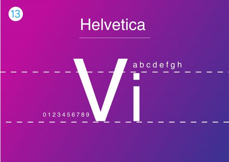
Helvetica is a versatile HTML font as its clean design is suitable for any type of display.
It’s a popular sans serif typeface used by many renowned brands. For example, Jeep, Microsoft, Motorola, and BMW use this font for their logos.
Other than that, the U.S. government also uses Helvetica on its tax forms.
Furthermore, this font type is designed for small size uses such as text displayed on e-readers and mobile devices.
Courier
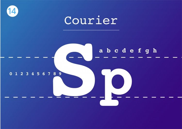
Courier is the most famous font in the slab serif classification – all operating systems come prepackaged with it.
This HTML font has been a standard for movie screenplays as well. Therefore, if your website is related to film, definitely consider adding Courier to your site design.
However, since this font is classified as decorative, it’s best to limit its use to headers and titles.
Comic Sans MS
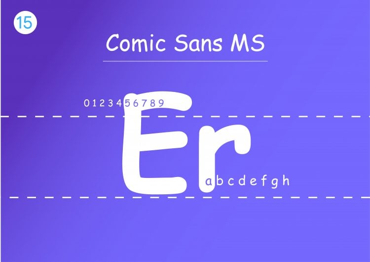
Comic Sans MS is a font for non-serious writing. It is mostly used to convey jokes, and non-serious literature materials.
Didot (serif)
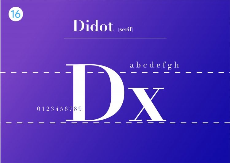
This old French typeface was originally used for printing presses. It’s notable for its elegant aesthetic and can add a formal quality to your copy.
Palatino
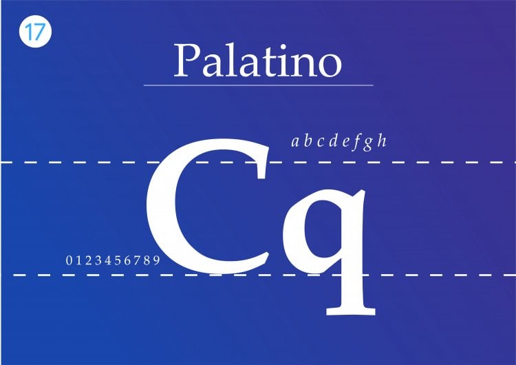
Palatino is another large font that is perfect for the web, traditionally used for heading and print-style advertisement.
Geneva
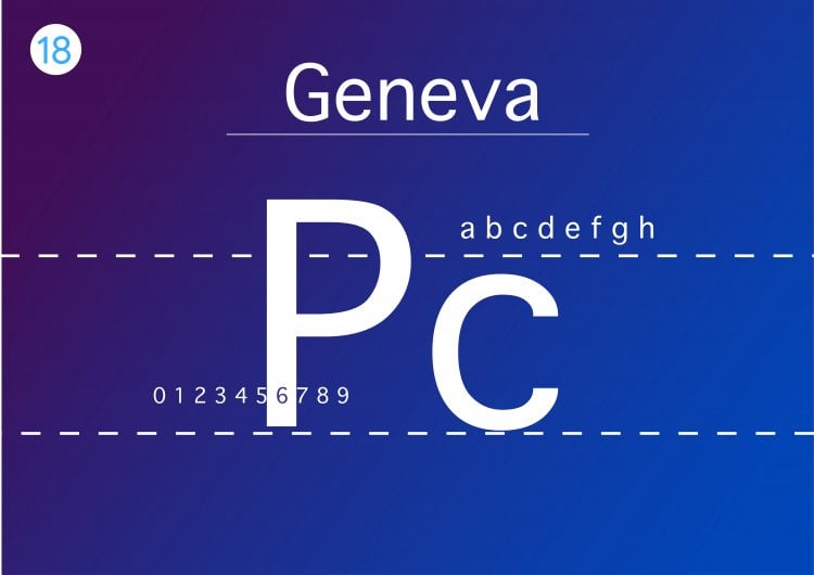
Geneva offers a clean and modern look due to its consistent length, width, and spacing.
The font is versatile and widely used for both display and body text. The bold colors and slim strokes make this font legible in any size – it offers generous spacing with consistent length to ensure readability.
Calibri
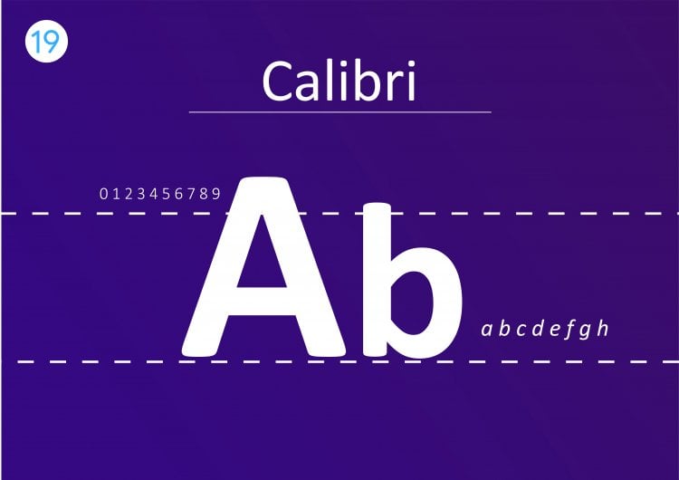
Calibri is a widely used and popular typeface. It is a default font for various well-known software such as the Microsoft Office suite and Google Docs.
This font primarily comes off as modern and warm due to its rounded lines and clean style.
Additionally, Calibri works in a wide variety of text sizes. It is highly legible and suitable for both digital and screen displays.
Thanks to its clean design, this font fits all types of websites.
Optima
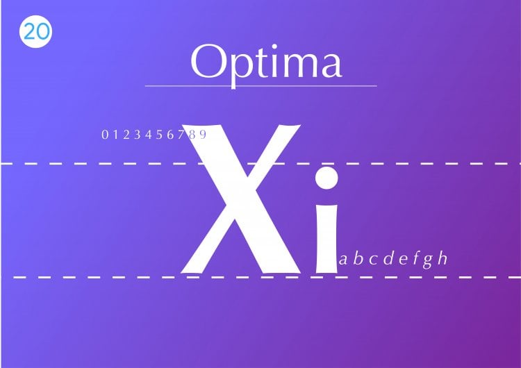
Optima finds its inspiration in classical Roman capital letters. It is used to convey elegance with its generous spacing and complementary strokes.
With Optima, you also have the option to define the spacing between each character.
While all the spacing variants are readable, setting the spacing wider will better complement this font.
Optima is best for display usage as found in logos for high-end brands like Estée Lauder and Marks and Spencer.
Conclusion
I tried to offer a little something to everyone. Keep in mind, that not all of these fonts will work for every website. So go through these fonts and learn which fonts best fit your business, industry, audience, and topic.
Let’s recap some of the most important things in this article:
- There’s a correlation between top websites and the fonts they use on their sites.
- A web-safe font is one that can be used on any device or browser without having to worry about it looking bad.
- There are three categories of font types: True Type, OpenType, and Cufon.
- Web pages with large amounts of text rank higher compared to those containing smaller chunks of words.
In this article, I explained what is a web-safe font, the different font styles, and which one you should use.
If you enjoyed this article, then you’ll love UltaHost hosting platform. Get 24/7 support from our support team. Our powered infrastructure focuses on auto-scaling, performance, and security. Let us show you the difference! Check out our plans


