Why don’t people visiting your website turn into new customers? Because they don’t find some crucial information there. If you’re wondering what elements you must include on your website, read this article carefully. I’ll show specific examples and give some advice to help you persuade customers more easily.
Before you start planning elements on the website
Let’s say you want to buy a car from someone. You find a nice advertisement and arrange a meeting with the owner. How do you imagine such a meeting?
Version A: The owner tells you about the car in two sentences and doesn’t allow you to look inside.
Version B: You learn everything in detail and can inspect the car from every angle.
Obvious, isn’t it? When you’re about to spend your money, you want to know as much as possible. You want to minimize the risk and understand the broader context. Customers considering working with you feel the same way. Your website is like a meeting with you.
Sounds like a cliché? Unfortunately, most websites of graphic designers, programmers, copywriters, and other creatives look like this minimum version of the meeting. The client learns a few generalities and doesn’t fully understand what they are buying. It is a significant obstacle for a potential customer and may be a reason why your online store doesn’t sell.
If you don’t inspire trust, there’s no chance of even the first contact. It often means that you’re not aware that excellent opportunities have slipped through your fingers. What to do about it? It’s simple – the website of your creative business should be rich in information. Remember to include on your website some crucial elements. It must describe in detail what you do, your approach, and why it’s worth trusting you.
In this post, you’ll learn about six elements that you absolutely must take care of. Treat it as inspiration and a list of ideas for improvements.
Describe What You Do
People visiting your website have problems for which they seek solutions. Let them have no doubts that you are someone who deals with topics that interest them. Describe your services in detail and show what your specialization is.
Check if:
- You clearly show what you do.
- You explain in detail how you can help potential clients.
- The description of your specialization is understandable to the client.
Example:
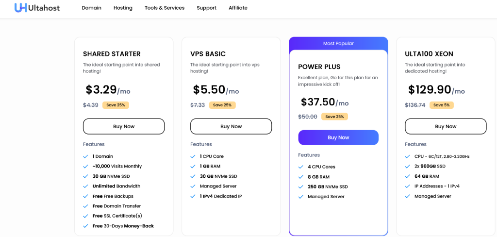
UltaHost has divided its services into several main areas: domains, shared hosting, VPS hosting, VDS hosting, and dedicated servers. In addition to that, it points out specialized services that the client can take advantage of, such as CRM hosting. Each of these areas is targeted at a different type of customer.
This way, different information is directed to each segment of customers with different needs. Furthermore, each service has been described in detail, making it clear what to expect from such a service.
Explain Your Process
Customers are interested not only in what you do but also in how you approach it. The result is not always the most important thing. Your approach also matters. In eCommerce, this is a big issue because many people find it very difficult to imagine what creating a logo or conducting a photo session looks like.
To help customers understand your service and value it, include on your website detailed explanation of your work process. By describing it understandably and in detail, you build more trust.
Check if:
- The client knows how you execute projects and what your process is.
- The client understands how collaboration looks, its course, and its stages.
Business Hosting As Easy As Pie
If you want to buy a high-performance server for your business but are afraid that it might be too technically challenging and you won’t handle it, don’t worry! Purchase a VPS from UltaHost, and our support team will always assist you whenever you need it. Choose a VPS with CyberPanel, which is user-friendly, and you’ll see for yourself that it’s nothing complicated.
Example:
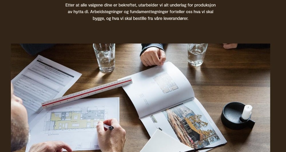
Leve Hytter, a company producing wooden cottages, clearly demonstrated the most relevant elements of collaboration through photos and short text. Although the website is in Norwegian, I have no problem understanding this process.
Show Who You Are
People like to buy from other people with flesh and blood. Appearance in business is important and studies confirm that employee photos on the company’s website increase conversion. It’s not worth hiding only behind the company logo. Include on your website some pictures. Show yourself as an individual or a team, and let yourself be known more closely.
Check if:
- It’s possible to get to know you better through the website.
- You tell enough and comprehensibly about yourself.
Example:
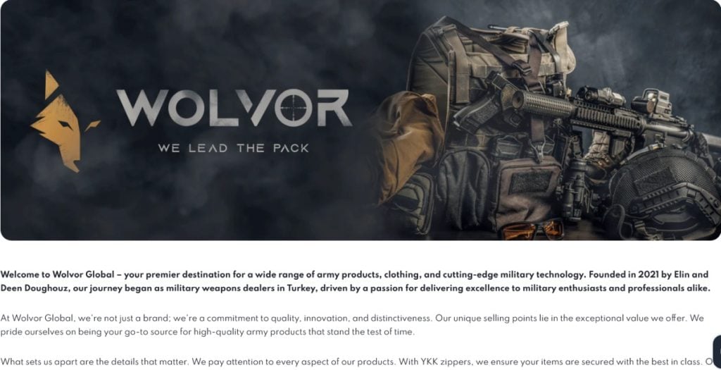
There are many examples to follow in this area, such as blogs, internet creators, and eCommerce businesses. Look at Wolvor Global, for instance, where the owners thoroughly describe their story, which builds trust with the target audience. It shows that these are projects created by experts who know their stuff.
Why You Do It
Include on your website description of your values and reasons for running the business. There may be thousands of hosting providers in the world, but your reasons for choosing this particular high performance WordPress hosting for agencies service can be unique. It’s a great way to stand out and show clients your way of thinking.
Check if:
- You explain why you do what you do and what made you have this particular business.
- You show your values, way of thinking, and motivations.
- You talk about the message and mission behind your business.
Example:
The creator of the Ugmonk brand has very detailedly described his story. It shows how he turned a simple dream into a successful company. There’s passion in this and higher goals than just a desire to make money. Also, take a look at the Curate Labs website, where you’ll find a nicely presented manifesto of the organization.

Place Contact Information on Your Website
Don’t limit yourself to a contact form. Include on your website a phone number or other details that make it easy to talk to you (e.g., email, social media, live chat or chatbot). Customers are impatient and have many choices. The easier it is for them to start the first conversation, the better for you.
Check if:
- Contact details are clear and easily accessible.
- You provide several contact options.
Example:
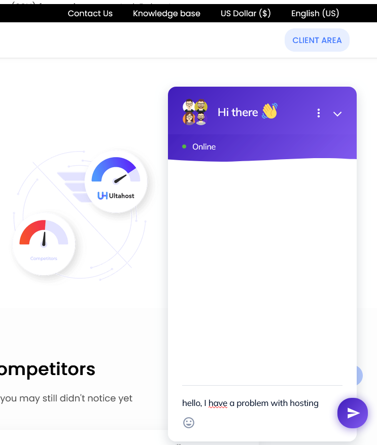
Here, we’ll go back to UltaHost again. The company prioritizes top-notch customer service, making contact as easy as possible. On every subpage, a chat window opens up, where you can talk to UltaHost specialists, ask questions, or find solutions to your problems. Contact is at your fingertips; you don’t have to search for it.
For the company, it doesn’t matter whether you’re buying shared hosting or a fully-managed dedicated server; everyone can expect customer support at the highest level.
Why Trust You
Also, include on your website other elements that will minimize the customer’s perceived risk. These could be, for example, references or reviews, certificates, courses, education, etc. Numbers showing the scale of activity or experience can also work well.
Check if:
- You provide objective reasons that prove you can be trusted.
- Various elements that help build trust are easily accessible.
Example:
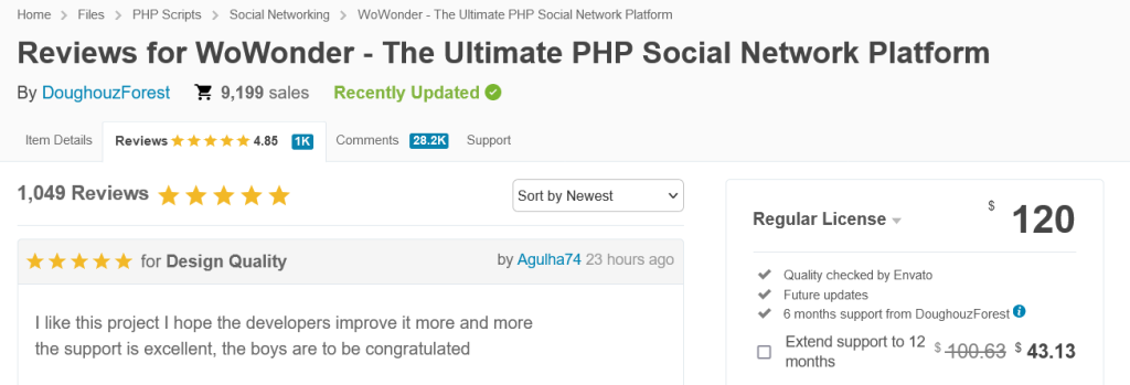
The creator of WoWonder – The Ultimate PHP Social Network Platform, showcases hundreds of reviews, opinions, and ratings on the CodeCanyon platform. Thanks to the feedback from actual customers who consistently buy and positively rate the product, prospective clients are more inclined to believe in the honesty and credibility of the company.
Instead of a conclusion – the 5W Formula
Most of the points I’ve described can also be summarized using the simple 5W Formula, which serves as a checklist and a good summary of this post. According to this method, a good website should provide answers to five questions:
- What do you do? What is your approach?
- Who are you?
- When will the product be ready? What does collaboration with you look like? What is your process?
- Why do you do what you do? What sets you apart? Why choose you?
- Where can you be found? How can someone contact you?
Consider what questions and uncertainties your client might have. What could they be looking for? Don’t let them guess or leave disappointed. I hope these few ideas will help you improve your website and achieve your ultimate goal of maximizing sales and profits.
If you enjoyed this article, then you’ll love UltaHost hosting platform. Rent a VPS and get 24/7 support from our support team. Our powered infrastructure focuses on auto-scaling, performance, and security. Let us show you the difference! Check out our plans!
FAQ
Why is it important to include detailed information on our website?
It’s crucial to include detailed information on your website because it helps build trust with potential customers. When visitors can clearly understand what services you offer, your approach, and why they should trust you, they are more likely to engage with your business.
How can we effectively describe our services on the website?
To describe your services effectively, make sure to clearly showcase what you do, explain in detail how you can help potential clients, and ensure that the description of your specialization is easily understandable for the client.
How can showcasing who we are improve our website?
Showing who you are, whether as an individual or a team, humanizes your business. Including photos and personal details helps customers connect with you on a more personal level. Studies confirm that employee photos on a company’s website increase conversion. Make sure visitors can get to know you better through your website and that you provide enough information about yourself.
Why should we explain our work process on the website?
Explaining your work process on the website helps customers understand not only what you do but also how you approach your work. This transparency builds trust. Check if the client knows how you execute projects and what your process is. Make sure the client understands how collaboration looks, its course, and its stages.


