When we create products, websites, texts, or send offers, we want to do our best to collect positive feedback and praise about our work. The first barrier we must overcome is the human eye, the brain that interprets this data, and the primal mechanisms that once helped humans survive in the wild.
There are 30-ish years old people who look so young that they are asked for an identity document when buying alcohol. They may be taken less seriously in business meetings – at least initially. Even when we try to be fair and objective, the first impression is decisive. It can impact the subsequent experience with the person, company, or product.
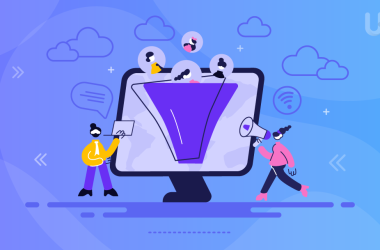
Quick assessment
When we create, we line up in a queue for the attention of other people. When we finally get it, the audience looks at us with interest for a moment, but on closer inspection, they often leave disappointed. Whenever did you happen to react very emotionally to a situation, only to feel embarrassed after a moment? It is a normal situation.
People first evaluate the appearance – graphic design, layout, visual identification, clothing, or colors. They decide within a fraction of a second whether it is worth investing their time or maybe it is better to go further. And it’s not a lack of good manners or a person’s wrong values. It is how nature programmed us.
I know what you are thinking – nobody wants to be judged by its cover. This is why we don’t want to make shallow decisions ourselves. Unfortunately, we are generally much less rational than we think.
Why do we evaluate quickly and superficially?
In the book Blink: The Power of Thinking Without Thinking of Malcolm Gladwell we find a description of a curious experiment. Students were asked to evaluate lecturers based on a few seconds of video recording. Then they regularly attended these lectures for six months. It turned out that in most cases the opinion expressed after a video was in line with the one formulated based on six-month classes.
It is the so-called First Eye Prediction Error. The information that reaches us first affects us the most and the first impression is difficult to change later. Suppose, for example, that you have a new friend at work. She is late on the first day and is very rude to you. Due to this first negative impression, you will judge her more severely in the following days. If she would be polite and sympathetic on the second day, you will consider it a coincidence.
Only after several weeks, you may change your mind about her. It is the same for brands, products, websites, and everything we come across.
We are often not aware of it, but we constantly evaluate our surroundings. It is the product of tens of thousands of years of evolution to survive in difficult conditions. An early warning system was to help us notice a possible danger at the right moment. Such a system had to work in fractions of a second – if a tiger was racing towards us, there was no time for reflection.
Although nowadays we don’t worry about predators hidden behind trees, the habit of quick assessment protects us against drowning under the flood of information.

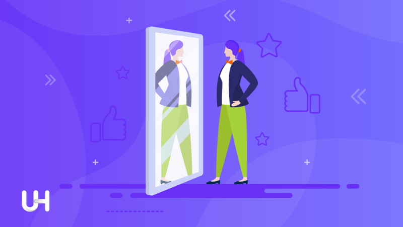
Nice things work better
We are selective and superficial. We do not think as rationally as we wish; we don’t evaluate with our gray cells but with our eyes. Sight is the most important human sense. Thanks to it we obtain 80%-90% of information about the environment. The human eye contains around 250 million receptors that collect various signals and transmit them to our brains. The brain analyzes them and decides about color, size, or shape.
If we were to compare our attention and interest to a fashionable and elite club, our eye is the head of the bouncers who conduct the selection and decide who to let in.
Donald Norman, the author of Emotional Design, describes a study where a group of people was testing two ATMs. Both devices had identical functions, only appearance separated them. The first ATM was dirty and shabby and the second was clean, nice, and new.
Although the ATMs differed only in aesthetics, the prettier ones always won in all criteria. For example, survey participants claimed that it withdraws money quicker, and has a better interface and button layout. All these aspects were the same. The positive reception caused by the appearance translated into the evaluation of all other elements.
This psychological phenomenon is called the Halo Effect. It always occurs when we transfer our assessment of one feature to another and generally, it refers to appearance. When something seems new and pretty, we are much more likely to find that it works well. So the halo of good looks shines over other features. The other way is similar: what is ugly, we more often considered to be of little value.
Appearance does not matter?
Despite this, I have heard many times that appearance does not matter:
- The customer doesn’t care what my logo is;
- The interface does not have to be nice because the most important thing is its usability;
- Even the ugliest blog will defend itself with interesting content;
- Presentation slides don’t have to be pretty;
- Clients don’t rate the restaurant by the interior and menu design;
- Audiences don’t pay attention to whether my social media graphics are well designed.
Hundreds of studies and our behavior say otherwise. Of course, if there is nothing of value behind the beautiful setting, the disappointment of the recipients will probably be even greater. We ought to take care of both aspects – the substantive value and the form of the application.
However, we like to disregard the latter. Often the reason is not a lack of willingness, but rather a lack of skill. We realize that a good project will work to our advantage, but we don’t know how to create it ourselves, and at the same time, we lack the resources to outsource such work to someone.
How to take care of graphic design?
For over a dozen years, the development of graphic programs has been taking place. Today you don’t need advanced graphic skills or a thick wallet to improve the quality of your materials. Much of it is now a matter of wanting and knowing what is possible to do.
We have already described several ways to do this on our blog.
First, you can take advantage of free image and photo repositories. If you do not want to waste time searching or expect more original photos you can reach for premium repositories. Or you can use free graphic design tools to make them on your own, even if you don’t have graphic skills.
The next stage is assigning tasks to a professional. You can find them on freelance sites, of which there are dozens, and listing is usually free. The quality of their work can be very high and the costs low.
Coherent, uniform advertising materials are a way to strengthen your company’s position in the market. The characteristic color, logo, and name are the primary elements that distinguish you from the competition.
The consistently implemented company policy, manifested in consistent advertising materials, inspires trust. The customers appreciate the stability and consistency of your company. Such an investment – of time or a small amount of money – will pay off with much more profit.
If you enjoyed this article, then you’ll love UltaHost hosting platform. Get 24/7 support from our support team. Our powered infrastructure focuses on auto-scaling, performance, and security. Let us show you the difference! Check out our plans!