Typography is all around, shaping how we read, feel, and react to information silently? We encounter them on a daily basis. Ranging from print advertisements to magazines, all sorts of fonts exist in the world.
Whether you are a store owner for e-commerce or an aspiring blogger, one thing that all websites share in common is the employment of text for content.
Taking some consideration of your display text (or typography design) is not surprisingly crucial when designing an overall look for your site and for making it successful. Yet above all, they must be web-safe fonts.
Key Takeaways
- Prioritize Readability and Accessibility: The most significant consideration is how legible the font is. Choose fonts with good letter forms, sufficient line spacing, and contrast against the background.
- Choose Performance-Optimized Fonts: Site speed is critical to user experience and SEO. Use fonts that are light and easy to load. Variable fonts are a big trend for 2025.
- Every font possesses a personality: A cheerful, rounded type will express something very different from a clean, minimalist font. Choose a typeface that fits your brand personality, such as modern, sophisticated, friendly, or professional.
- Utilize Font Pairing for Visual Hierarchy: Avoid using one font. One fabulous and good idea is to apply a display font to titles and a body font for body text. The most common pairing is a bold serif heading and a clean sans-serif body.
- Consider Sans-Serif for Body Text: For body copy on the web, sans-serif fonts (the kind without the little flourishes on the letters) are still the default. They’re usually better to read on a screen and are the easy go-to for simple, clean designs.
- Celebrate the Return of Serifs for Display: While sans-serifs are still the standard for body type, serifs are making a comeback, particularly for titles and special regions. A clear serif can provide sophistication and refinement.
- Test on Multiple Devices: What is aesthetically pleasing on a desktop might not be so great on a mobile screen. Be sure to test your font selection across different devices and display sizes to see that it’s readable and consistent across the board.
- Use a Limited Palette: Limit your font choices to a single. Double family for consistent and professional look. Too many fonts negatively impact the look of a site.
What are secure web fonts?
Web-secure fonts are font types that are typically pre-installed and are viewable on most devices computers, mobile phones, smart televisions, and tablets.
Find Affordable Power with VPS Hosting!
Looking for reliable hosting without breaking the bank? Experience the perfect balance of performance, security, and affordability with UltaHost’s VPS Hosting. Upgrade your website’s capabilities and scale with confidence.
Should I use secure web fonts for my website?
If you want to maintain consistency in the web design ideas and visual branding of your website, using a web safety font ensures that your site looks exactly the way you wanted it to. Here are the best 20 HTML web fonts for you in 2025.
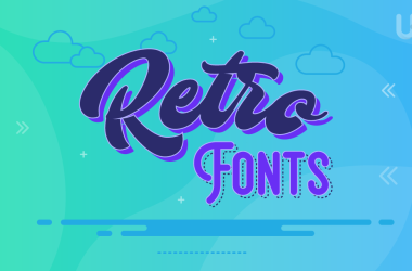
Arial (sans-serif)
Arial is the most widely recognized of all the sans-serif fonts in the world. It’s renowned for its clean and refined appearance, and it’s been a web-safe norm for many years. It possesses regular spacing, harmonious proportions, and readability, making it a suitable option for business sites, blogs, and electronic papers.
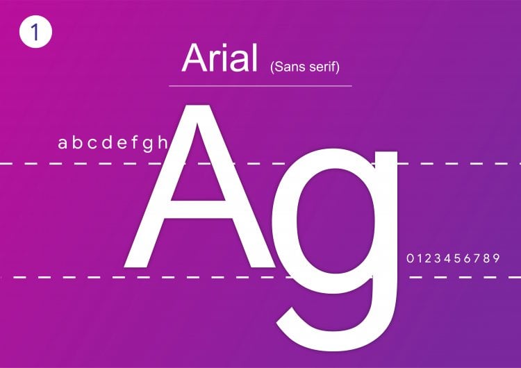
Times New Roman
Times New Roman is a classic serif typeface that has been the publishing and academic standard for centuries. Its vintage appearance conveys professionalism, seriousness, and credibility, making it ideal for formal websites, print publications, and lengthy articles. Times New Roman continues to be popular.
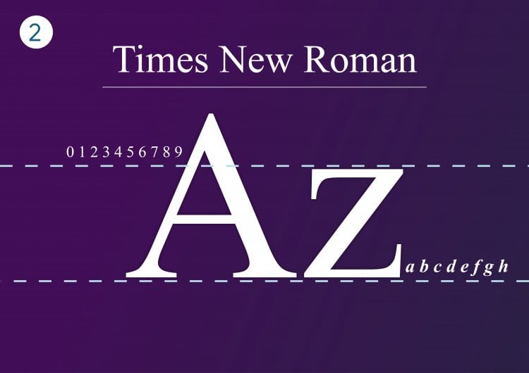
Courier New
Courier New is a monospaced serif font. Each character is the same width, and this makes it very popular for coding, programming manuals, and displaying tabular data. Where readability in smaller sizes can be an issue.
Arial Black (sans-serif)
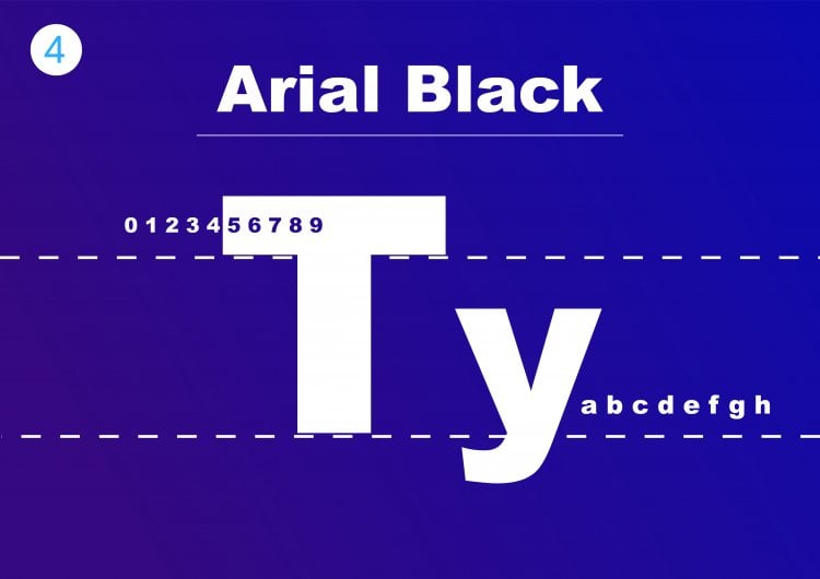
Arial Black is a weighty variant of the standard Arial font, designed to create high-impact visuals. Its sturdy strokes make it well suited for titles, banners. Less weighty in tone. It ensures it’s readable.
Arial Narrow
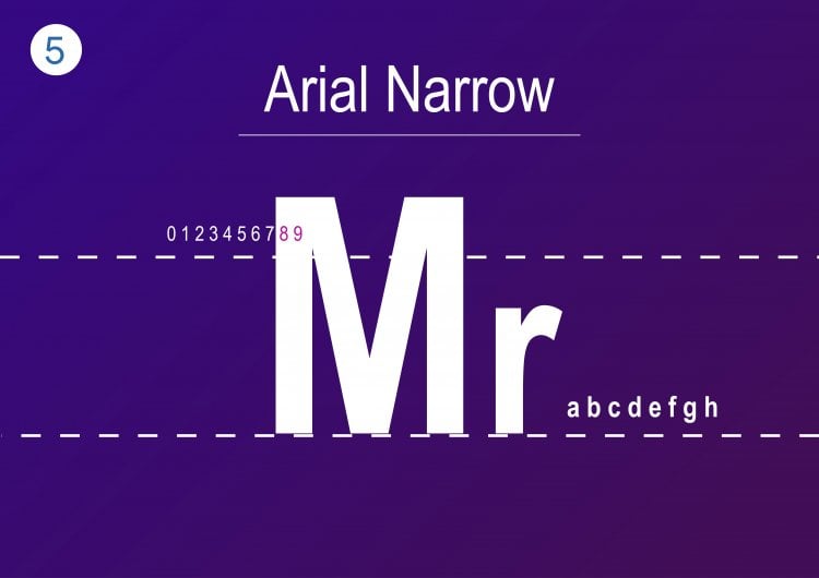
Arial Narrow is a thin version of Arial, the standard typeface. Its slim presence allows additional text to be added in limited spaces without sacrificing readability. It is suited for websites with low-layout space or narrow navigation menu design. Designers prefer using Arial Narrow for modern, simple websites that value minimalism.
Candara
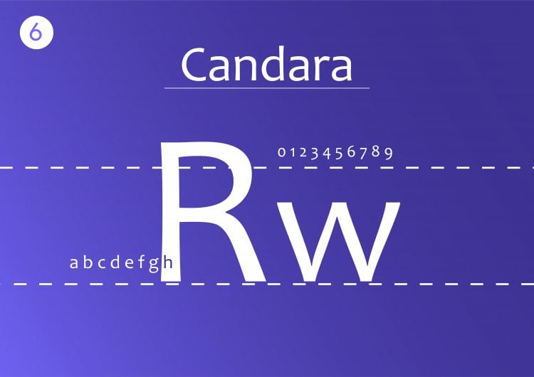
It has a light, rounded appearance that evokes a friendly, inviting atmosphere. This makes it ideal for lifestyle sites, creative portfolios, and casual brand identities. Fresh look without losing readability.
Verdana (sans-serif)
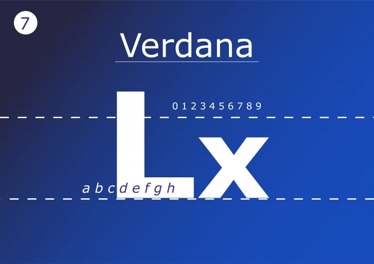
Its wide spacing and generous x-height make it very readable on screens, tablets, and mobile phones. Its clean design and satisfactory performance at small font sizes render Verdana suitable for blogs, business sites, and online shops. While it may not offer the style of fashionable personalized fonts and host is supposed to offer a guaranteed uptime of at least 99.9%.
Garamond
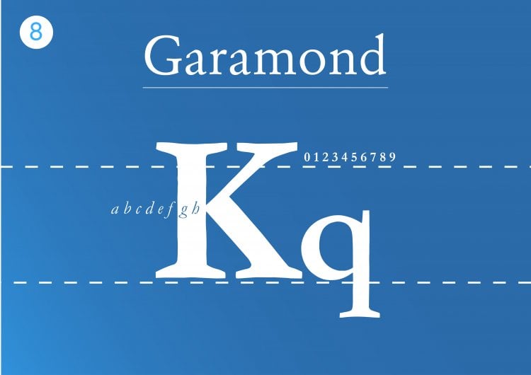
Garamond is an elegant, classic serif type of font. Praise is heaped upon it as the font of the print book, and it commands a reputation for subtlety and timelessness. In the virtual world of cyberspace, Garamond adds an antique sheen to literary or academic websites. It is perfect for headings and quotes.
Times
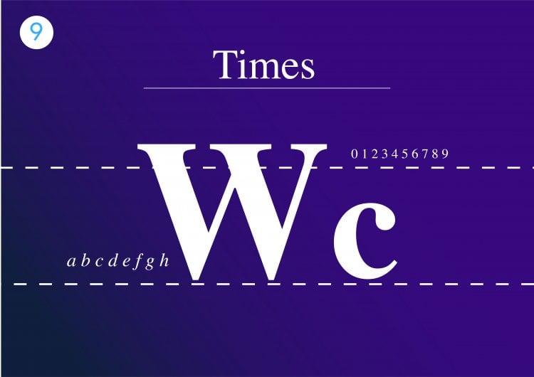
Times is the font on which Times New Roman was based, intended for print publishing in the 1930s. Less commonly used in web design now. Used on the web, Times is appropriate for scholarly or historical use.
Georgia
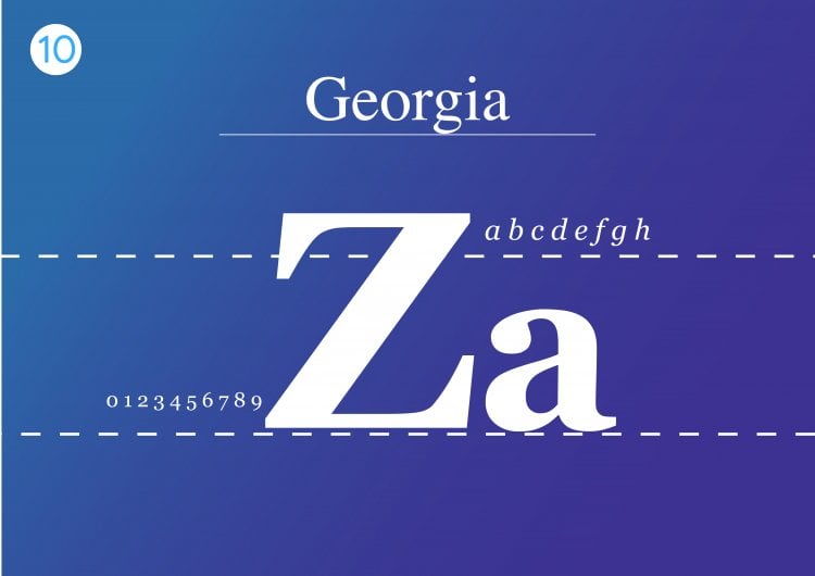
Georgia is a screen-specific serif typeface which has come. Its large x-height and wide line spacing make text look sharp and clean even at smaller font sizes. It produces a classic serif appearance without losing high on-screen clarity.
Trebuchet MS (sans-serif)
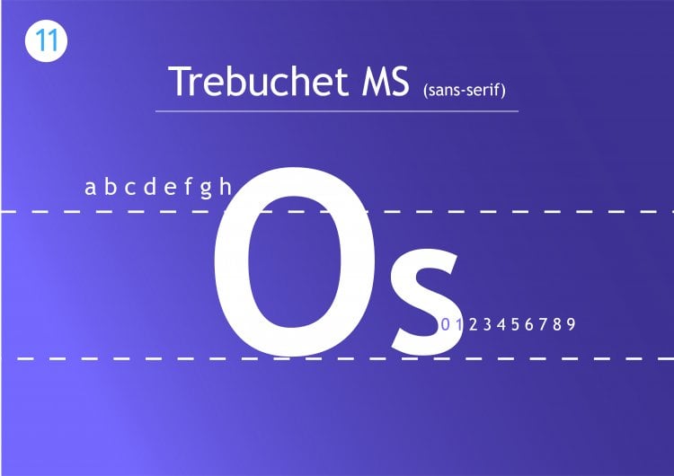
Perfect for on-screen readability. Smooth strokes and wide letter spacing make it friendly and modern. Trebuchet MS can be applied to headings, body text, and user interfaces where legibility is paramount. The balance between professionalism and warmth has caused Trebuchet MS to persist over the decades.
Bookman Old Style
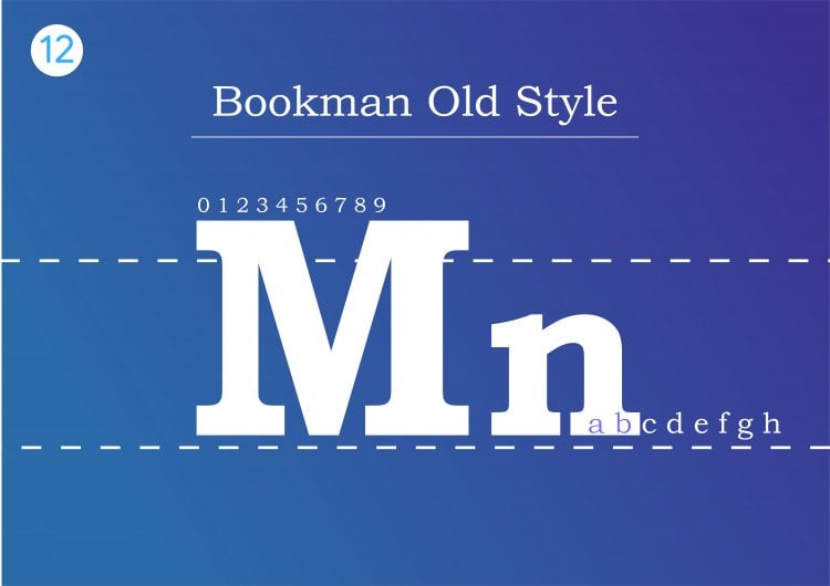
Bookman Old Style is a serif font with a classic, literary aesthetic. It is wide, rounded characters and warmth and the look of classic elegance. Bookman Old Style is used frequently by designers for titles, pull quotes, or editorial layouts where a touch of class is needed.
Helvetica
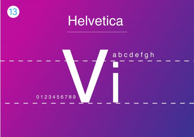
Helvetica is a versatile HTML font as its clean design is suitable for any type of display. Its simple, neutral look makes it suitable for almost any type of site, ranging from portfolios that are simple to corporate websites. Helvetica is now inseparable from modern design. It is a high recommendation for tech companies, startups, and brand schemes.
Courier
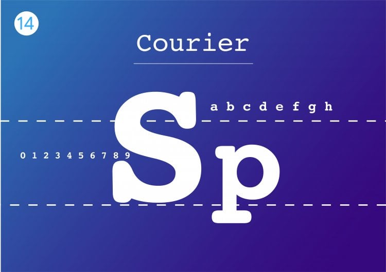
Courier is the classic monospaced typewriter font. It remains a favorite among developers, authors, and designers who want to simulate a typewriter effect. This is due to its simplicity and universality, which make HTML an important development tool to be learned by any web developer or designer.
Comic Sans MS
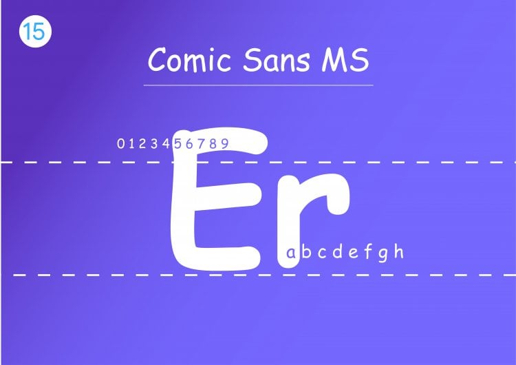
Perhaps the most famous and controversial typeface in design history. Comic Sans MS is a warm. It with an informal and casual atmosphere. Children’s websites, or casual branding. Its informal. Giving the impression of being unprofessional.
Didot (serif)
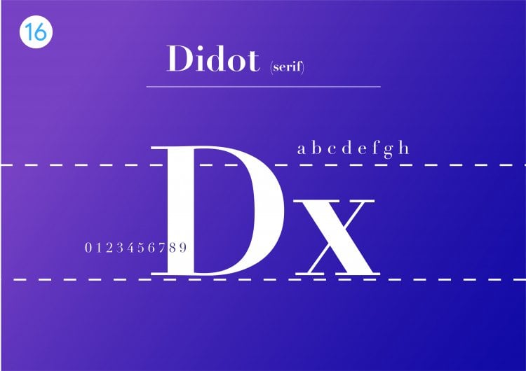
Didot is a high-contrast. Sophistication and extreme thin-to-thick stroke transitions. Created in the late 18th century. It adds a feeling of high-end, high-fashion to modern digital design. It performs best for headings, logos, or fashion, beauty, and design industry branding. Lovely at larger sizes.
Palatino
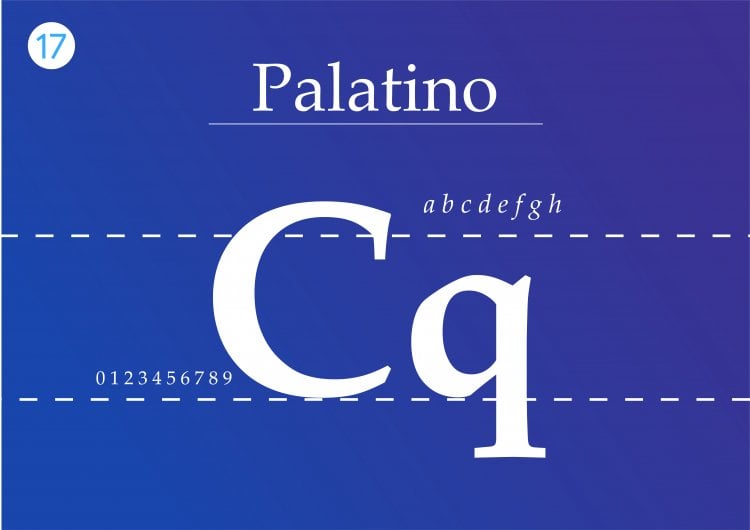
Palatino is a classic serif font with open proportions. Derived from Renaissance calligraphy. It balances tradition and legibility. Giving a traditional, scholastic feel to websites. For added website security, consider using high ram vps services.
Geneva
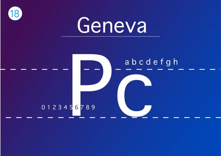
Geneva is a sans-serif font designed for Macintosh. Known for being simple and readable, it has a modern, neutral appearance which suits a variety of digital initiatives. Its minimalist, clean look makes Geneva an excellent selection for user interfaces, software, and spare websites.
Calibri
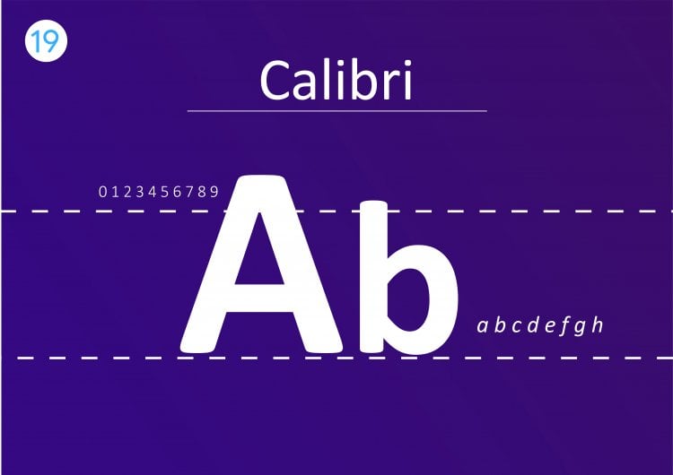
Calibri is a widely used and popular typeface. Its rounded edges and modern proportions give a softer. On-screen, Calibri is appropriate for professional reports, business websites, and blogs.
Optima
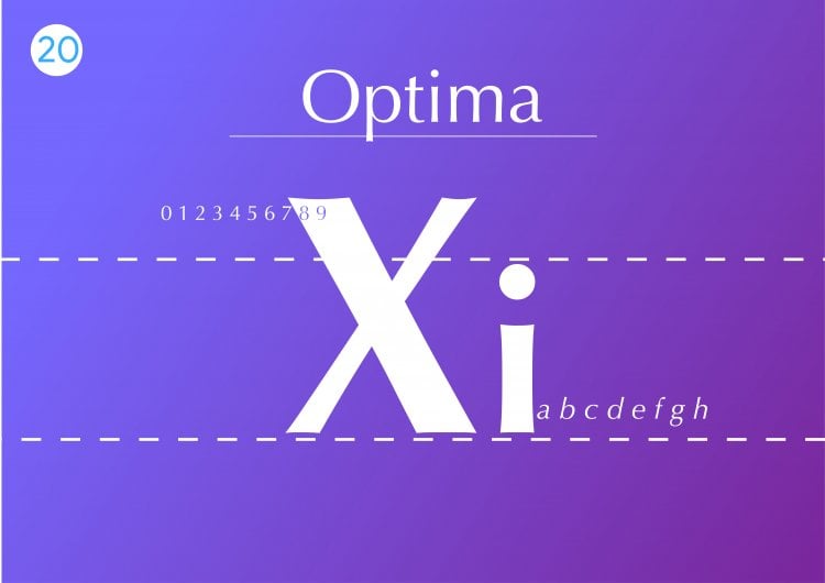
Optima is an outstanding sans-serif typeface with classic proportions conjoined with modern simplicity. Geometric sans-serifs are characterized by their less pronounced stroke modulations that grant it a cleaner, more humanist look.
Conclusion
Selecting a nice font isn’t merely a matter of design this is something that will have a direct effect on the manner in which individuals will engage with your site. Choosing fonts that are fast to load, legible across devices, and lightweight is critical not to lose the visitor. This is why using an old reliable fallback font.
If you enjoyed this article, then you’ll love UltaHost hosting platform. Get 24/7 support from our support team. Our powered infrastructure focuses on auto-scaling, performance, and security. Let us show you the difference! Check out our plans
FAQs
What are the most readable web fonts in 2025?
The most readable web fonts of 2025. They are the screen-optimized Roboto, Open Sans, Inter.
How many fonts should I use on a website?
Two or three typefaces are ideal for a site. Second-string accent font saved for highlights or callouts.
What are Google Fonts free to use?
Google’s rich library of open-source fonts are easily embeddable in your website straight away with a quick code snippet or downloadable for local usage.
What fonts work best for web performance?
Implement variable font-optimization will load the quickest. Verdana will reduce load times and maximize site speed.
How can serif and sans-serif be used together on a website?
Yes, serif and sans-serif fonts can be combined together. That balance between aesthetics and readability.
What is the distinction between web-safe fonts and web fonts?
Web fonts introduce creativity, while web-safe fonts enable reliability and fallback.
What fonts are optimal for mobile-friendly design?
The optimal fonts for mobile-friendly design are modern, clean, and extremely readable fonts even at small font sizes.