Color theory and the strategies based on it are the fundamental basis for creating harmonious designs. Have you ever wondered what the psychological impact of colors is on your decisions? In this article, I will explore this topic, focusing on practical business aspects.
Colors play an essential role in our daily lives. When was the last time you were red with anger or yellow with envy? We use color associations unconsciously and regularly in different languages. Look at blue: in German, blau sein (to be blue) means “to be drunk”, while in English, to feel blue means “to be sad”.
Cultural characteristics play a significant role in the psychology of color. Therefore, familiarize yourself with the cultural meaning of colors when designing your marketing and visual strategy. Take into account the importance of colors in different languages and cultures.
Research shows that over 90 percent of purchasing decisions are determined by visual factors, with color having the greatest impact. Moreover, consumers make purchasing decisions unconsciously within the first 90 seconds. Colorful advertisements can also receive 40 percent more attention than colorless versions. So as you can see, you must appreciate the impact of colors on your customers’ choices and your business.
Colors and emotions
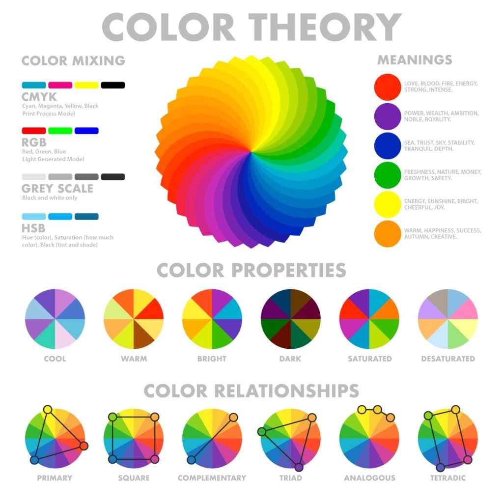
Warm colors have stimulating and activating properties. However, if they are used too dominantly or arranged in a disharmonious way, they can also create anxiety. You can use these features to your advantage – for example, by using them sparingly and consciously as a call to action – because these colors directly attract attention.
If you use too much red and yellow in your designs, your message can be lost and annoys the users.
On the other hand, cool colors have a calming effect. These cool colors, which also partly come from warm colors, can have properties of both warm and cool colors. For example, the color green often has a calming effect while also being invigorating. On the other hand, pure shades of purple stand out and appear rather loud.
The psychological effect of colors
Color in marketing and branding is a powerful tool that can influence the perception of a product or service. Each color has its psychological effect on consumers, and understanding the impact of colors can help businesses create effective marketing strategies.
Explore the psychological effects of different colors, including yellow, red, orange, green, blue, pink, purple, brown, black, white, and grey, and how they can be used to communicate different emotions and messages.
Yellow
Yellow is a color that the human eye perceives first. The food and retail industries particularly like to use yellow because the color can emphasize or intensify feelings of hunger. The color yellow also symbolizes summer feelings and good moods. It is associated with youthfulness, lightness, optimism, and openness.
However, the color yellow also reminds us of discounts and sales. A product with such a color can easily be classified as “cheap.”
Red
Red attracts our attention and also symbolizes activity and readiness for action. Objects and elements in red appear spatially closer than other objects. In addition, since childhood, we have been taught to recognize the color red as a warning and signaling color. Red represents danger and passion equally in our perception.
Orange
Orange inspires trust and leads to impulsive purchases. Additionally, orange shades are associated with creativity, optimism, and joy in life. Like yellow, orange color also stimulates the appetite. It is composed of yellow and red and has energetic properties.
The telecommunications provider Orange used the name directly and composition of orange color and various shades of black. It makes the orange color look not only modern but also serious.
Green

Green is, among other things, the color of money. It can increase the purchasing power of your customers. Green is located in the middle of the color spectrum and therefore is the most balanced color. When the world around us is green, we instinctively know that nothing threatens us. We feel safe and shop with a sense of security.
Blue

Blue represents relaxation, serenity, rest, freedom, depth, loyalty, and longing. This color is not recommended for the food industry because blue shades have an appetite-suppressing effect. Blue is the statistically most frequently used color in logos and corporate identities which is a proof that professional business understands the impact of colors.
Blue represents the values popular in business: trust and stability. Check our hosting for business to see how UltaHost used this color. People perceive blue as serious, honest, and safe. Additionally, blue is associated with summer, sea, and travel.
To create a beautiful website, you need elegant themes. When you choose WordPress hosting from UltaHost, you get a lot of beautiful premium templates for the price of hosting. Create your elegant WordPress website with our reliable hosting!
Pink
Pink symbolizes gentleness, care, and love. Stereotypically is considered a color for girls or women. Therefore, this color is also often associated with femininity. Less intense than red, it still attracts attention but has a softer effect and symbolizes compassion.
Purple
Extravagance, exclusivity, and luxury – that’s what many shades of purple symbolize, especially when combined with gold. Companies use it in the production of cosmetics and luxury items. We often see purple also used in connection with spirituality.
Brown
Brown is a warm, natural color for industries related to coffee, outerwear, and wood. It symbolizes closeness to nature, safety, confidence, and reliability. It embodies down-to-earthiness and is not as assertive as green but slightly more friendly than gray or black. Brown shades are also commonly used in interior design and the food industry.
Black

Black is noble, modern, and functional. Experts associate it with luxury, elegance, and seriousness but also with sadness. Especially in combination with other noble-looking colors such as silver and gold, you can find black in higher-end products.
White
White is associated with purity, innocence, and perfection. It is particularly popular in the wedding industry. White itself does not create emotions and takes on the attributes of other colors, making it great for minimalist and transparent compositions. Minimalism does not distract attention from the actual product but emphasizes it.
Grey

Grey is associated with professionalism and timelessness. Pure grey is the only color that cannot be attributed to any emotions from a psychological point of view. It does not mean that grey does not affect us. The lack of color also has consequences. The grey color itself can sometimes seem incomplete and oppressive.
In combination with other colors, grey often takes on an emotional effect. Web designers associate grey with seriousness and elegance. Grey seems simple and authentic and does not steal the show from the actual product. Moreover, grey does not have to be mixed with pure black and white and can therefore have warm or cool attributes.
Choose the perfect color for your company
Now that you know the meaning of each color: How do you choose the perfect color for your company? Refer to the brand identity. Try to describe your brand with adjectives, and then select the appropriate set of colors based on these adjectives that match your brand.
I also recommend learning about what colors other companies use in similar products. Analyzing the competition will tell you what has already been successful and what hasn’t. However, choosing similar color combinations for safety reasons may not be the right approach.
It’s crucial to learn from what already exists but be smart. If customers can’t remember your brand because most of the competition looks visually similar, they will forget your product quickly. Standing out from the crowd is at least as important as finding colors that speak to your target audience.
To see this for yourself, you can use user tests, such as A/B tests, to see if existing designs are effective. You can visually present different color variations using infographics or visual mockups created with an AI infographic generator to compare engagement and user response more effectively.
Conclusion
Understanding the psychological impact of colors is crucial in creating effective marketing and visual strategies. Not only is the right choice of colors important, but the overall concept must be consistent. For example, if you use confident, loud colors and a small, square font, you send two different messages.
The way we experience colors depends largely on the individual. For example, extroverted and introverted personalities have different color preferences. Gender and other demographic characteristics are also often differentiated.
But in the end, each of us has our associations. Maybe the color of your favorite blanket was yellow, so a particular shade of yellow evokes nostalgia for you. Different colors and shades are associated with different situations for us.
Colors evoke emotions and influence purchasing decisions, so analyze well what colors best reflect your message. Warm colors such as red and yellow can stimulate and attract attention, but if used too dominantly, they can create anxiety.
Cool colors such as blue and green have a calming effect. Some can be considered both warm and cool colors, e.g., purple.
Each color has its psychological effect on consumers, and cultural characteristics play a significant role in the psychology of color. Therefore, it is essential to familiarize oneself with the cultural meaning of colors when designing marketing and visual strategies to effectively communicate different emotions and messages.
If you enjoyed this article, then you’ll love UltaHost Fast WordPress Hosting platform. Get 24/7 support from our support team. Our powered infrastructure focuses on auto-scaling, performance, and security. Let us show you the difference! Check out our plans!


