The second part of the cycle of creating your first website is ahead of you. You set your site goals, defined the audience, and prepared a detailed site map. Now it’s time to finish and run!
If you missed the first part of the cycle, you can find it here: First website – Beginner’s Tutorial 1/2 – Goals, audience, and the sitemap.
Texts
Texts are the basis of most websites, so it’s worth taking enough time to prepare them well. Everyone writes that they have many years of experience, they are professional, the company is developing dynamically, and has a great team. You don’t need to duplicate this cliche just because you can see them on most pages. Create catchy and distinctive texts.
Tell a story
Storytelling is one of the fantastic marketing trends, and many studies show that stories are a very effective tool for information exchange and persuasion. The stories stimulate the imagination and bring back memories your audience can identify with. They are perfect when you want to evoke emotions in recipients.
Divide content and add headings
Well-chosen words are not enough. You should also not forget to divide the texts into appropriate fragments and refine the headings between them. People don’t want to read long blocks of text, so divide it into smaller parts.
As mentioned in the first part of the tutorial, the recipient beforehand scans the page superficially. They browse very generally, scroll, and evaluate whether it is worth reading further or not. Distinctive headlines give them a quick overview of the content, and short blocks make it seem easy to read.
Avoid jargon
Avoid industry slang and words that sound professional but put a lot of people off at the same time. Write in intelligible language. Then you are the specialist, not your client.
Working in the industry for years made you know it inside out and familiarized you with the vocabulary. It may be a foreign language for your reader. Therefore, try to replace professional slang with other, more universal and understandable words for most people.
Font and style
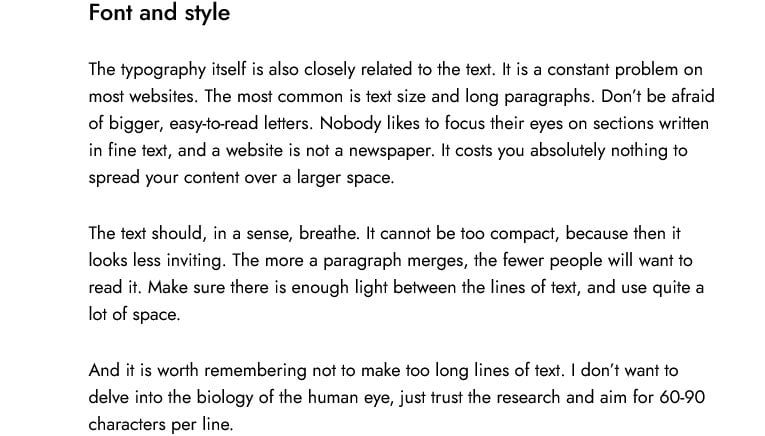
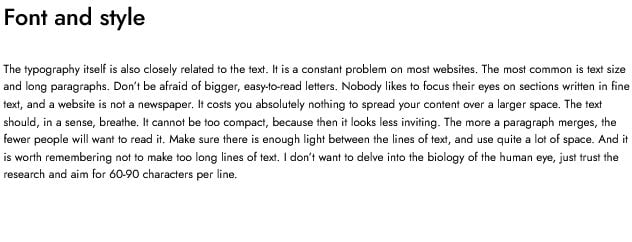
The typography itself is also closely related to the text. It is a constant problem on most websites. The most common is text size and long paragraphs. Don’t be afraid of bigger, easy-to-read letters. Nobody likes to focus their eyes on sections written in fine text, and a website is not a newspaper. It costs you absolutely nothing to spread your content over a larger space.
The text should, in a sense, breathe. It cannot be too compact, because then it looks less inviting. The more a paragraph merges, the fewer people will want to read it. Make sure there is enough light between the lines of text, and use quite a lot of space.
And it is worth remembering not to make too long lines of text. I don’t want to delve into the biology of the human eye, just trust the research and aim for 60-90 characters per line.
Example
You can see two texts below. The first text complies with the rules; the second is poorly composed.


BuzzSumo has analyzed over a million articles to catch how often you should use photos or graphics. The results showed that pages with a graphic element every 75-100 words are shared twice as often on social media.
So it’s worth remembering about the graphics. Many other pieces of research prove that storytelling with a picture increases not only the aesthetics; it boosts the effectiveness of your content, too.
The brain is said to decode graphic elements 60,000 times faster than text. You have probably heard the saying that one picture is worth more than a thousand words. It is crucial on the Internet, where the speed of information transfer is critical.
Whenever possible, speak with pictures

Try to use:
- charts,
- icons,
- photos,
- infographics,
- movies,
- animation.
Your message will be more interesting, faster, and easier to remember.
Make contact easier
Communication with website visitors will be better when it less resembles a monologue and more an equal discussion. A website inspires much greater trust as it allows easy contact with its creators, preferably in a direct and personal form. The website is an opportunity to share your content, but it shall invite your guests to a conversation as well.
It’s also worth trying to stay in touch with your audience. If someone has already visited your website and you have attracted their attention, it would be a shame to lose it. So remember to include links to social media profiles and let them subscribe to the newsletter. Building a mailing list is challenging, but it offers much more benefits and opportunities than capricious social media sites.
In return for subscribing to the newsletter, it is worth offering a particular value. It can be all kinds of discounts, promotions, or gifts, such as an e-book or video.
Build trust
The recipient must be sure that their data and privacy are safe. On the Internet, the topic of privacy, cybercrime, and various types of scams has grown in strength in recent years. Internet users are increasingly sensitive to what someone knows about them, how websites track their behavior, and how they use it.
Therefore, you also have to follow this trend and be very careful about collecting data and soliciting them to leave private information. You must be sure that the recipient understands it well and justify why you ask for the data.
Content Management System
As the name suggests, it is a mechanism that allows you to edit the content of your website easily. Thanks to it, its operation will not require knowledge of advanced internet technologies or programming languages. The content management panel allows you to update the page, and add photos and text.
It is advantageous because of two principal reasons. Firstly, it enables the website to be updated by people without experience in coding. Secondly, it significantly increases the editing speed.
There are tons of these types of solutions on the market, but the king is one: WordPress.

This CMS outclassed the competition because it focused on simplicity and the possibility of development. Anyone can create a website on WordPress; it is perfect for beginners. In addition, it is also a powerful tool for experts. You can make a stylish, lightweight, and swift website, perfectly optimized for SEO.
WordPress isn’t the only CMS neither is point-device. It may happen that another CMS will be more suitable for your website: PrestaShop, Joomla, or something else. So let’s read about other CMSs and choose the one that suits you best.
Take care of speed
It is one of the decisive factors of the position in the Google ranking and one of the most critical elements for Internet users. On the Internet, a second is a lot of time, and literally, with every millisecond of loading, more percentage of people turn off the page. Website optimization is responsible for 50% of the loading time and the server in the other half.
Therefore, it is not worth saving on hosting. The market is full of cheap hostings, but it’s not worth risking the entire project for a dozen or so dollars a year. Therefore, avoid the cheapest solutions and reach for at least the mid-range ones. Their price will still be attractive, and they will guarantee the adequate speed and ensure that the website won’t slow down due to sudden traffic peaks.
The best choice for a website based on WordPress is a hosting optimized for this CMS. Check the cheapest and fastest WordPress hosting on the market. Automatic installation, servers optimized for WordPress and total control over CMS: you can view, create, edit and delete WordPress installations, using a simple list of instances.
In the hosting panel you can install and manage WordPress plugins, test, and deploy without the trouble of leaving your Client area. Choose one of 500+ WordPress themes, generate backups, and perform system updates.
Don’t forget about smartphones
Recent studies show that around 80% of Internet users have a smartphone. Mobile devices have overtaken computers, and you shall not deny it. Website responsiveness, i.e., its ability to adapt to various screens, is one of the priorities you should pay attention to.
So, when creating your website, remember about responsiveness. If you’ve decided to go with WordPress, it won’t be difficult because most themes are responsive. Test the operation of the website on various devices and software variants. Check what your website looks like on the most popular tablets and phones, on different browsers and operating systems.
You are ready. Now you can start working on your website
- Buy a domain.
- Choose the best hosting for beginners.
- Select CMS and install it on the server with one click.
- Select a theme.
- Create your content
- Start the SEO optimization process.
- Test, improve and take care of your website.
If you enjoyed this article, then you’ll love UltaHost hosting platform. Get 24/7 support from our support team. Our powered infrastructure focuses on auto-scaling, performance, and security. Let us show you the difference! Check out our plans!


